New Dashboards Provide Full Overview
24 September, 2025

Infosoft has launched updated KPI dashboards, developed in close collaboration with customers.
Continuous Product Development
Info-Subscription has always provided state-of-the-art reporting functionality, but customers wanted a more straightforward dashboard view with their most important KPIs.
To answer this call, Infosoft launched its first dashboard last year, giving customers better insight into their business.
- Quick and accurate information is crucial. That’s why we launched the dashboards in the first place, and that’s why we have developed them further now, based on customer feedback, says Thomas Isegg, CCO at Infosoft.
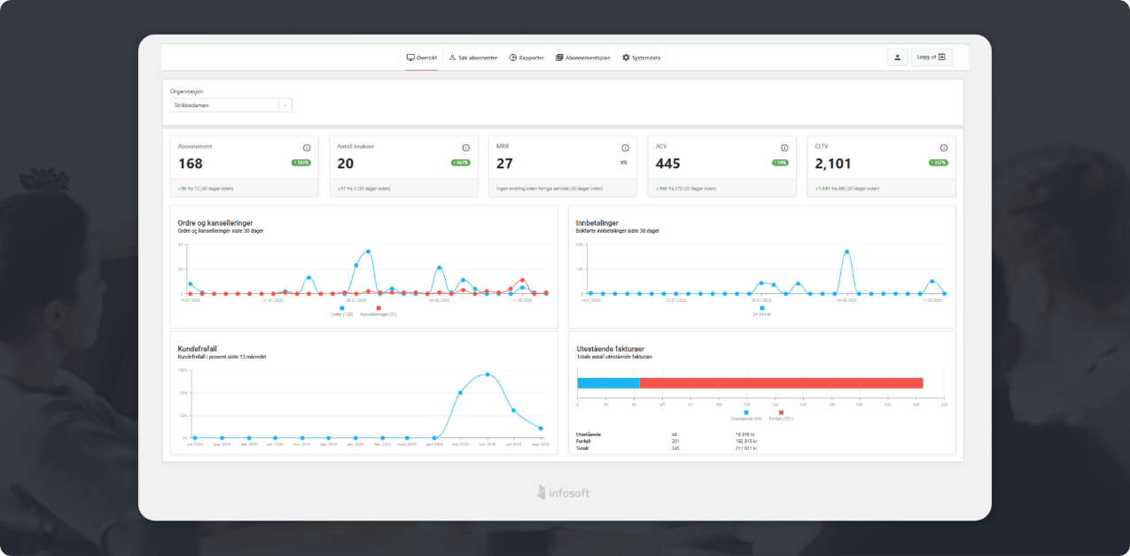
Simple Overview of Your Key KPIs
Our customers wanted to track and visualize even more performance data, and Infosoft has responded by expanding the dashboards, which now show:
- •Number of subscribers and users
- •MRR (Monthly Recurring Revenue)
- •Churn/customer attrition
- •Order & cancellations
- •Payments
- •
Total outstanding invoices
Split on before and after due date, clearly color-coded in red and blue - •
Average Customer Value
The average value per subscription - •
Customer Lifetime Value (CLTV)
Calculated based on purchase value, average purchase frequency, and expected lifetime
The dashboard is designed with simple and clear graphics, combined with intuitive color coding.
- Our customers can take a quick glance at the dashboard and get a good picture of their entire “business,” says Isegg.
Experiences from Akers Avis Groruddalen
One of the customers using the new dashboards is Akers Avis Groruddalen. Managing Director Øystein Kielland says the newspaper quickly noticed the value of visualized performance data.
- Yes, we’re very pleased with it, the dashboards provide us with actionable information. It’s a good way to start the day with a status update on how the subscription business is going, says Øystein Kielland.
The color codes also make it easier to see how things are tracking.
- We make sure to stay in the green zone. If some figures end up in red, it’s easier to find the cause and make adjustments, he explains.

From Numbers to Action
A graph showing the development of new orders and cancellations over the past 30 days has become an important tool.
- It’s easy to see how we are performing over time, and we can quickly act if there’s an unfavorable trend. This is something we use a lot, and everyone working in the system refers to the dashboards. We often start the day there, says Kielland.
Better Decisions, Better Operations
With new KPIs, clear visualizations, and practical color coding, Info-Subscriptions dashboards provide a comprehensive overview of the entire »subscription business«.
- Our goal is for our customers to be able to make better decisions, faster. The new dashboards are an important step in that direction, concludes Isegg.
